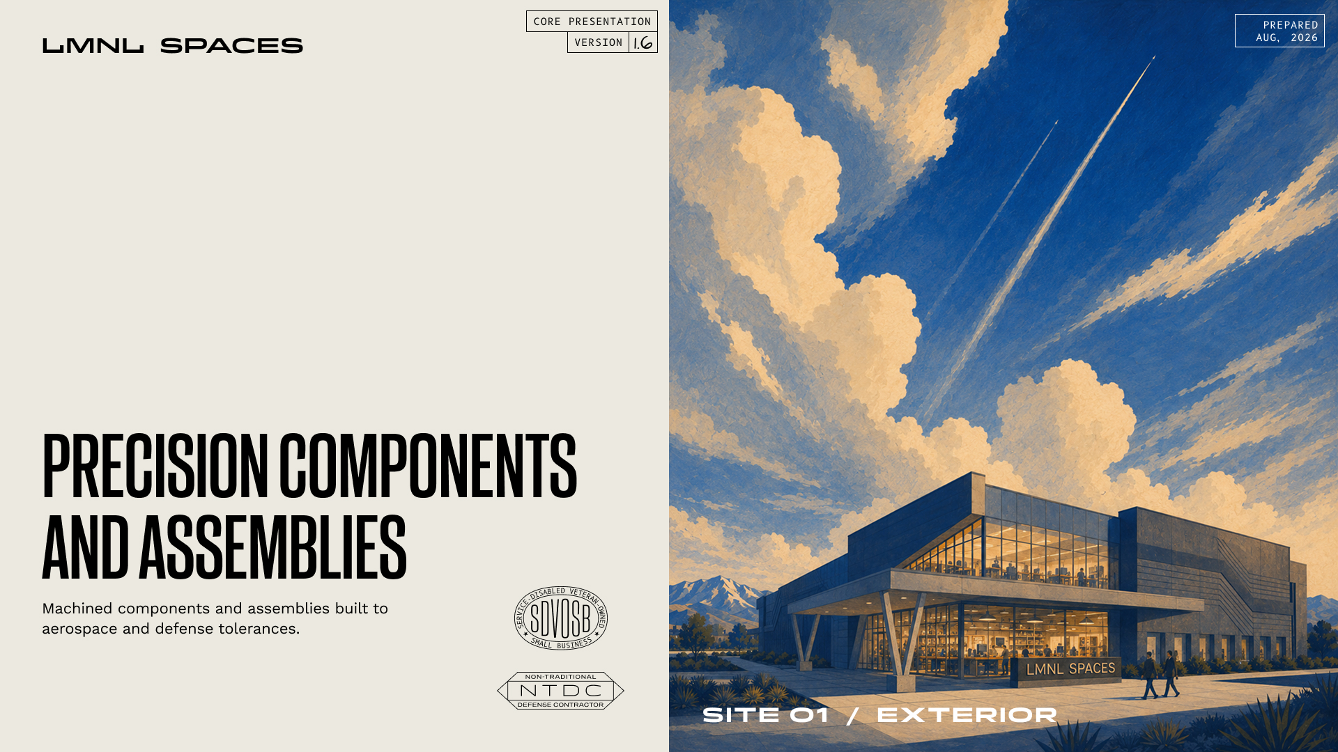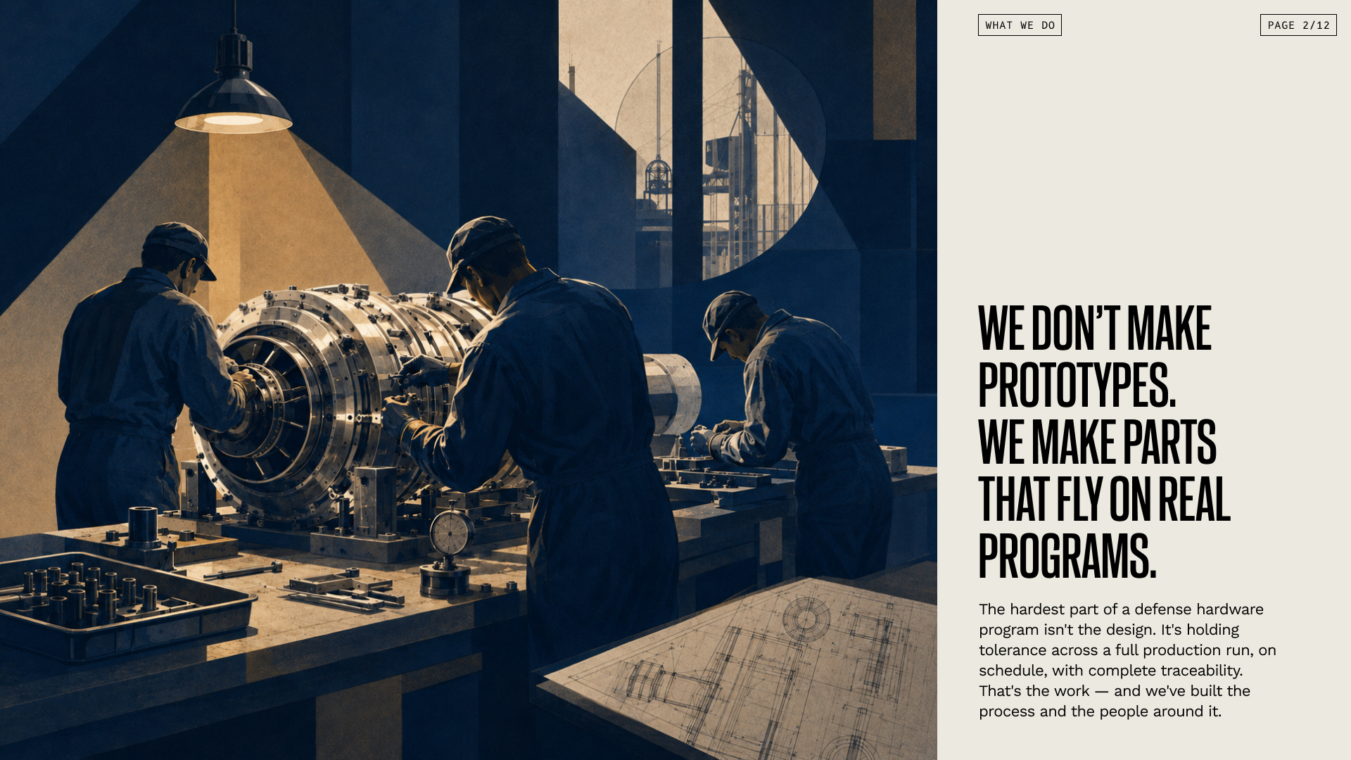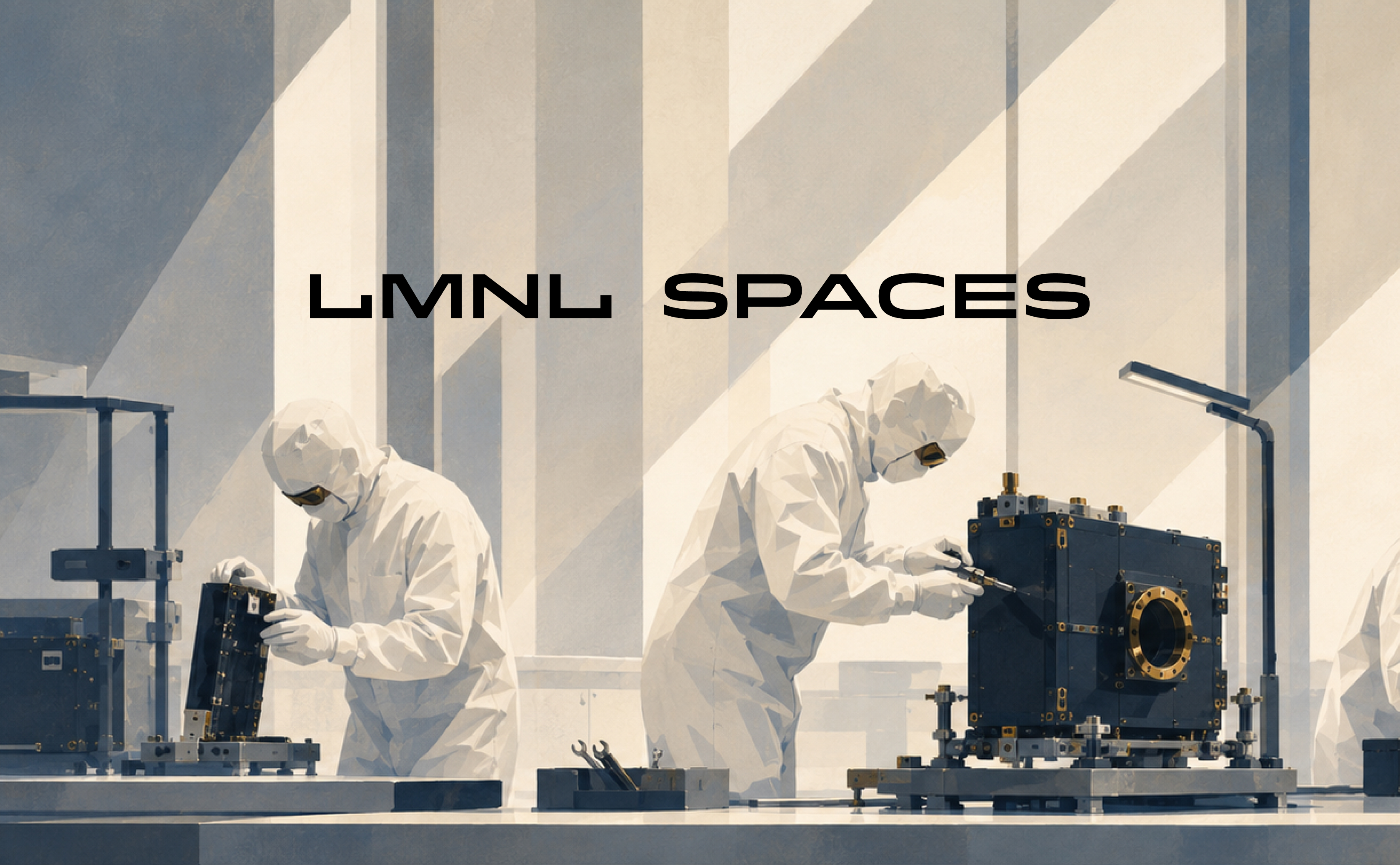
LMNL Spaces needed a visual system that could feel highly technical without disappearing into the visual clichés of aerospace and defense.
Brand identity, art direction & presentation system
Principal Designer at Inlay
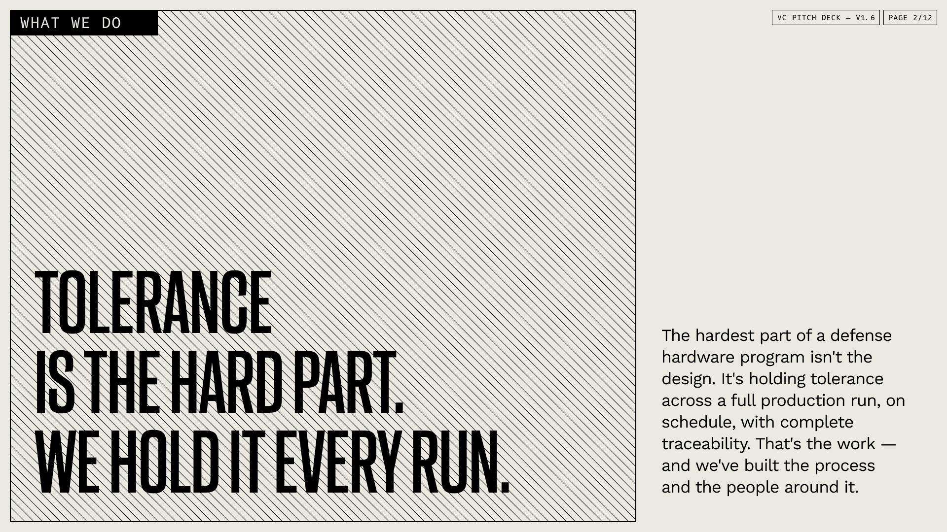
The central design problem was tone: credible and exacting, but not sterile or generic. I used compressed typography, modular marks, stamped graphic language, and a tight navy-and-cream palette to establish structure.
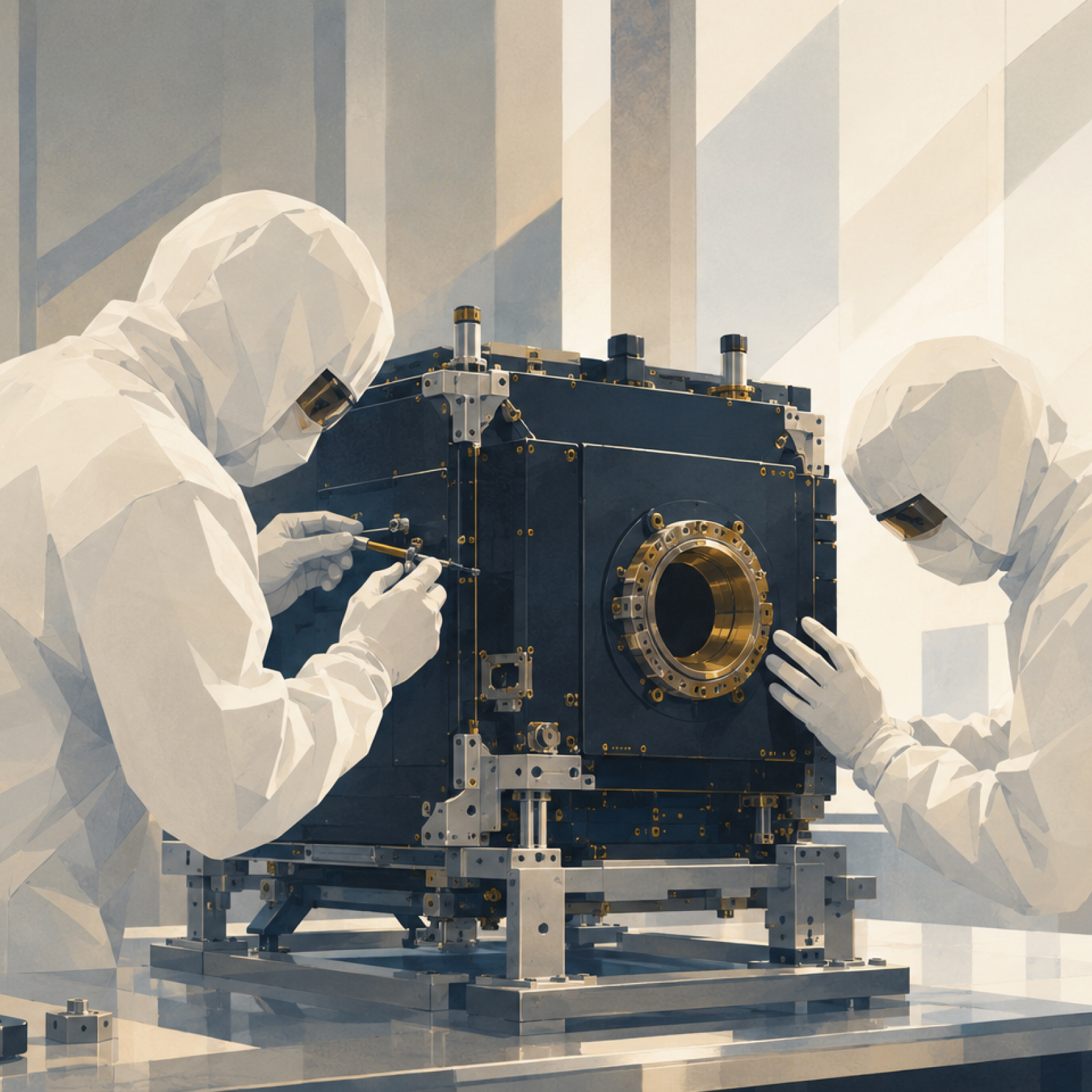
That precision is paired with warmer illustrative imagery and tactile texture so the system still feels human. The presentation system became a useful stress test for the identity, forcing large statements, dense information, imagery, and small utility labels to work as one family.
Presentation copy shown is placeholder.