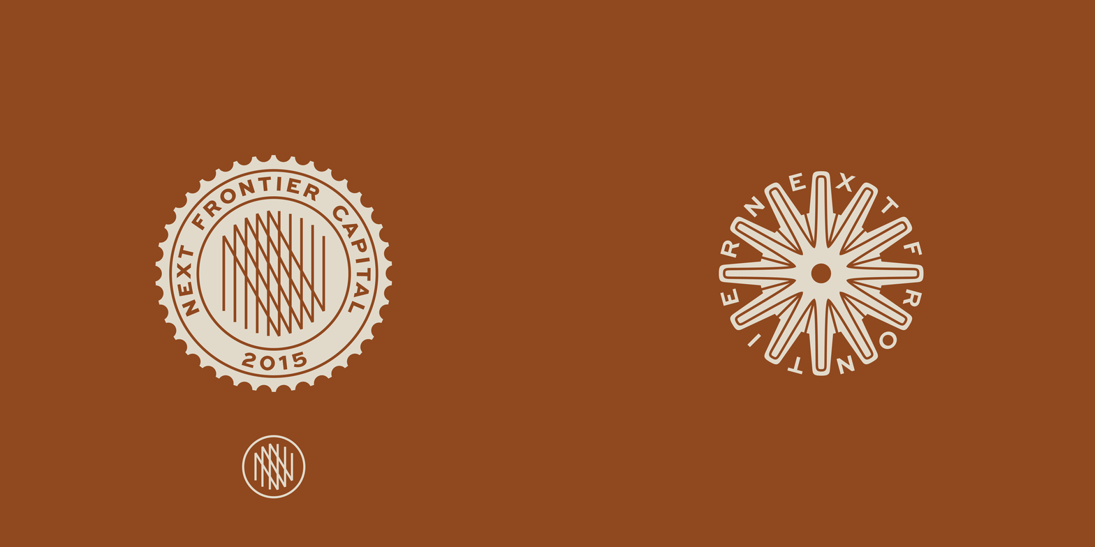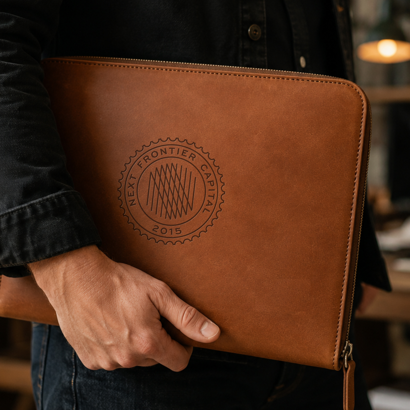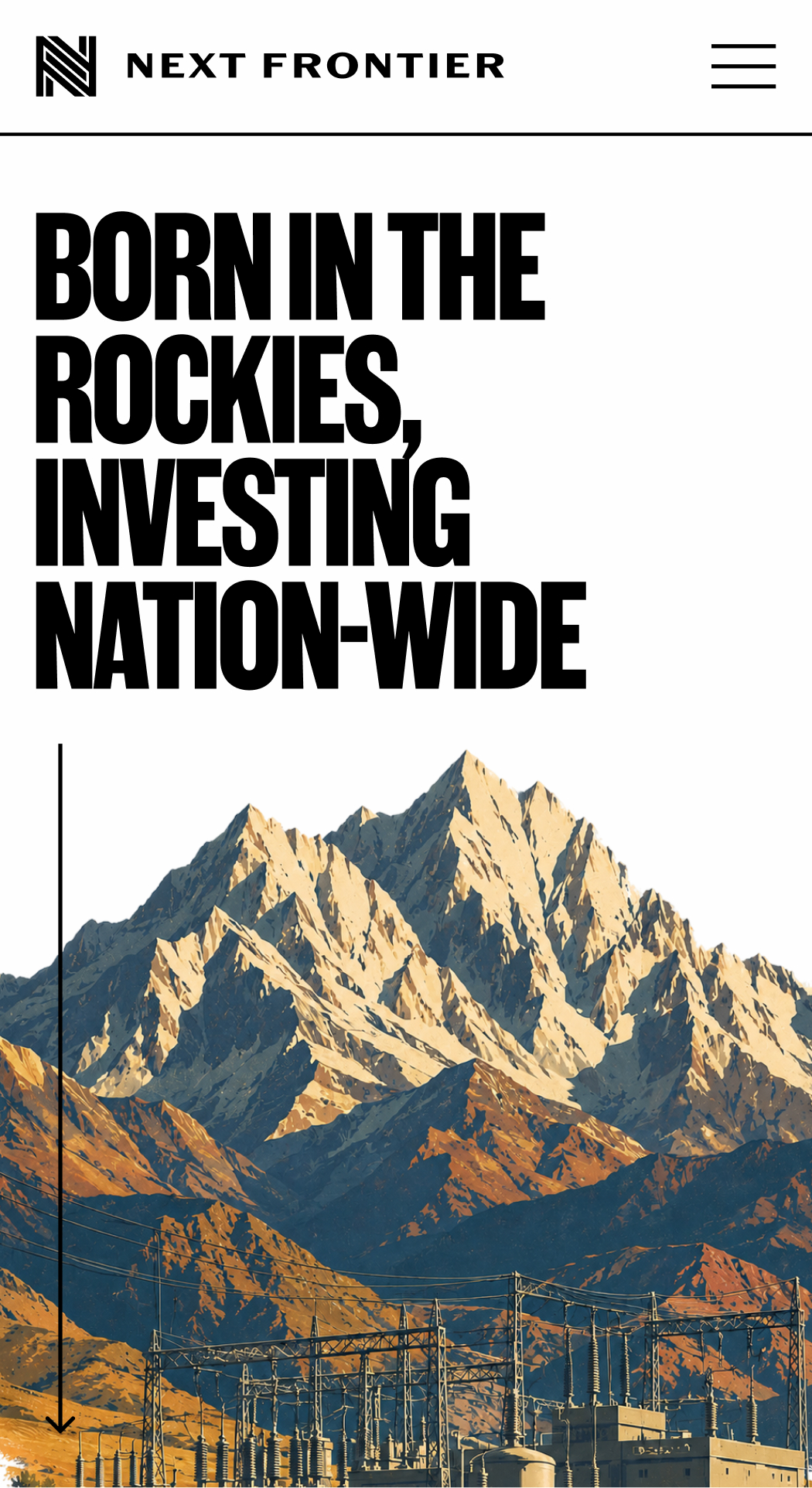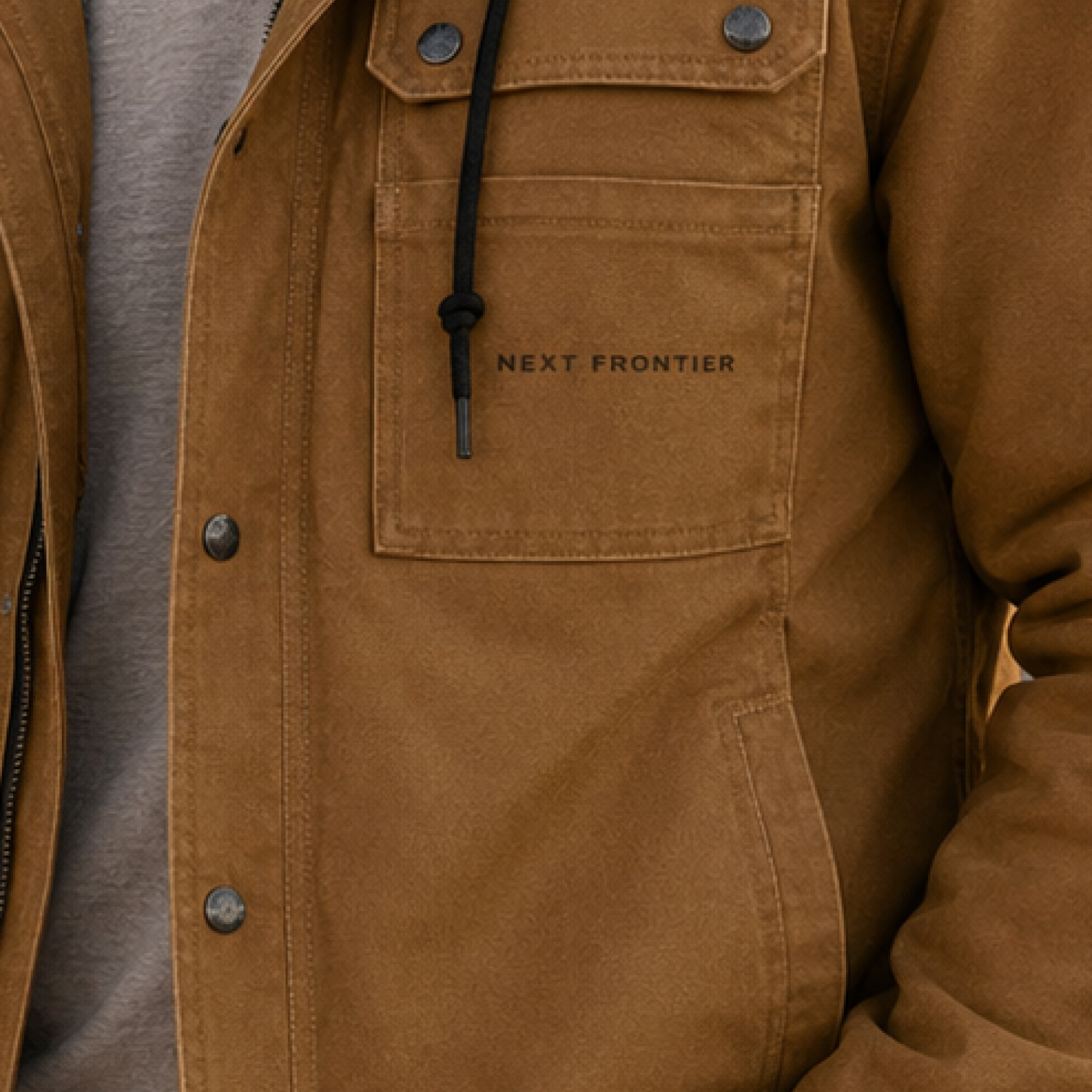
Next Frontier Capital is an early-stage venture firm backing technology companies across the Rocky Mountain region. I developed an identity that could feel established and investor-ready without losing the independent character of the place it came from.
Brand identity & investor-facing materials
Principal Designer at Inlay
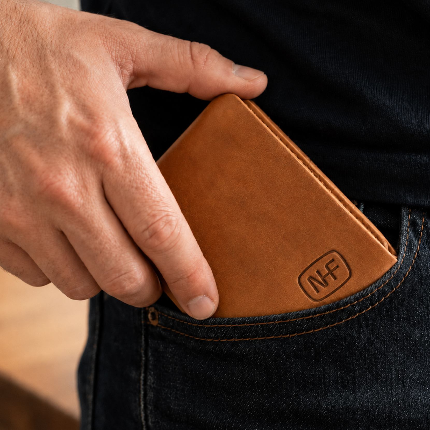
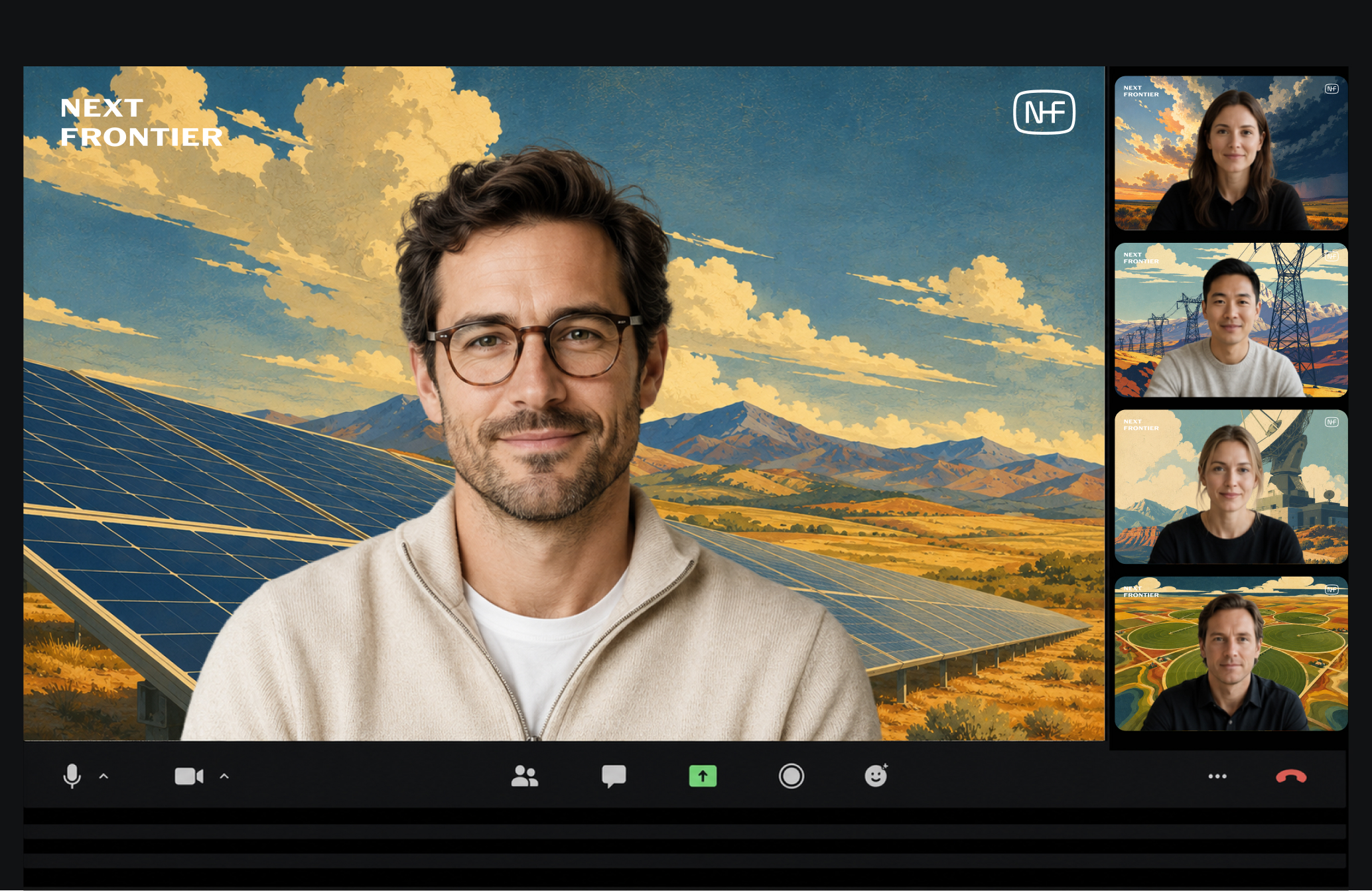
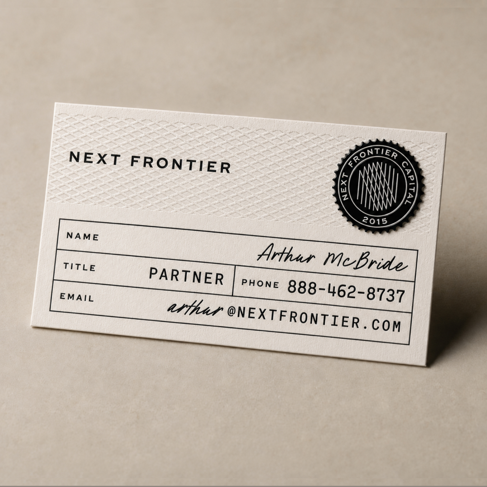
The core mark is deliberately clean and institutional; the surrounding system is looser. A family of seals, monograms, stamps, and field-inspired applications lets the brand move between investor materials, founder-facing communication, web, and everyday objects without becoming overly corporate.
The visual language treats “frontier” as a point of view rather than a costume — regional, resourceful, optimistic, and comfortable operating outside the traditional coastal venture-capital aesthetic.